In 2023, I was commissioned to be the visual designer for the Toronto-based music group’s winter festival program. My design concept combined an icy colour palette, a maximalist geometric theme, custom typography, and simple snowflake icon to create a truly unique visual statement across a wide variety of design formats.
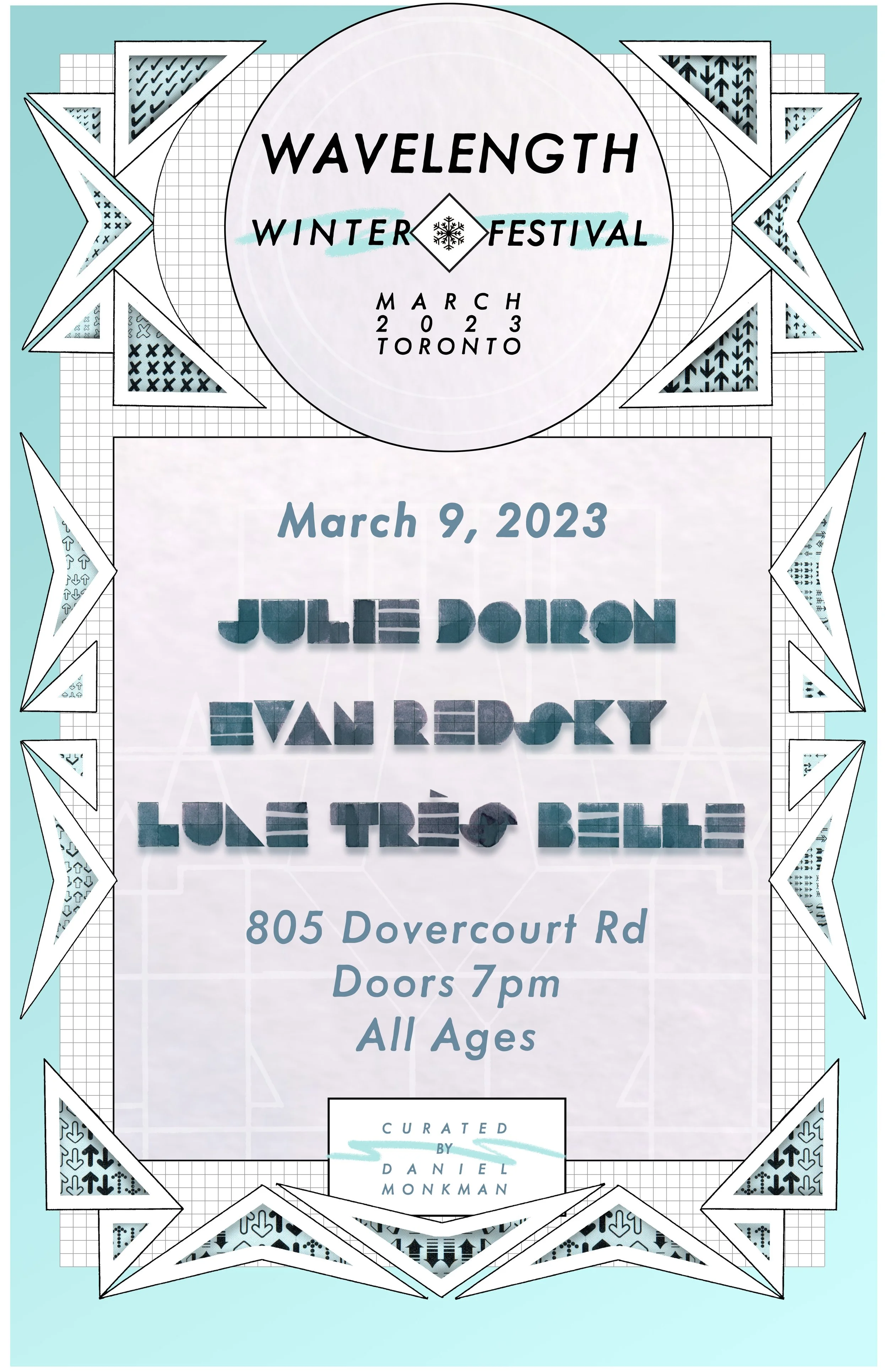
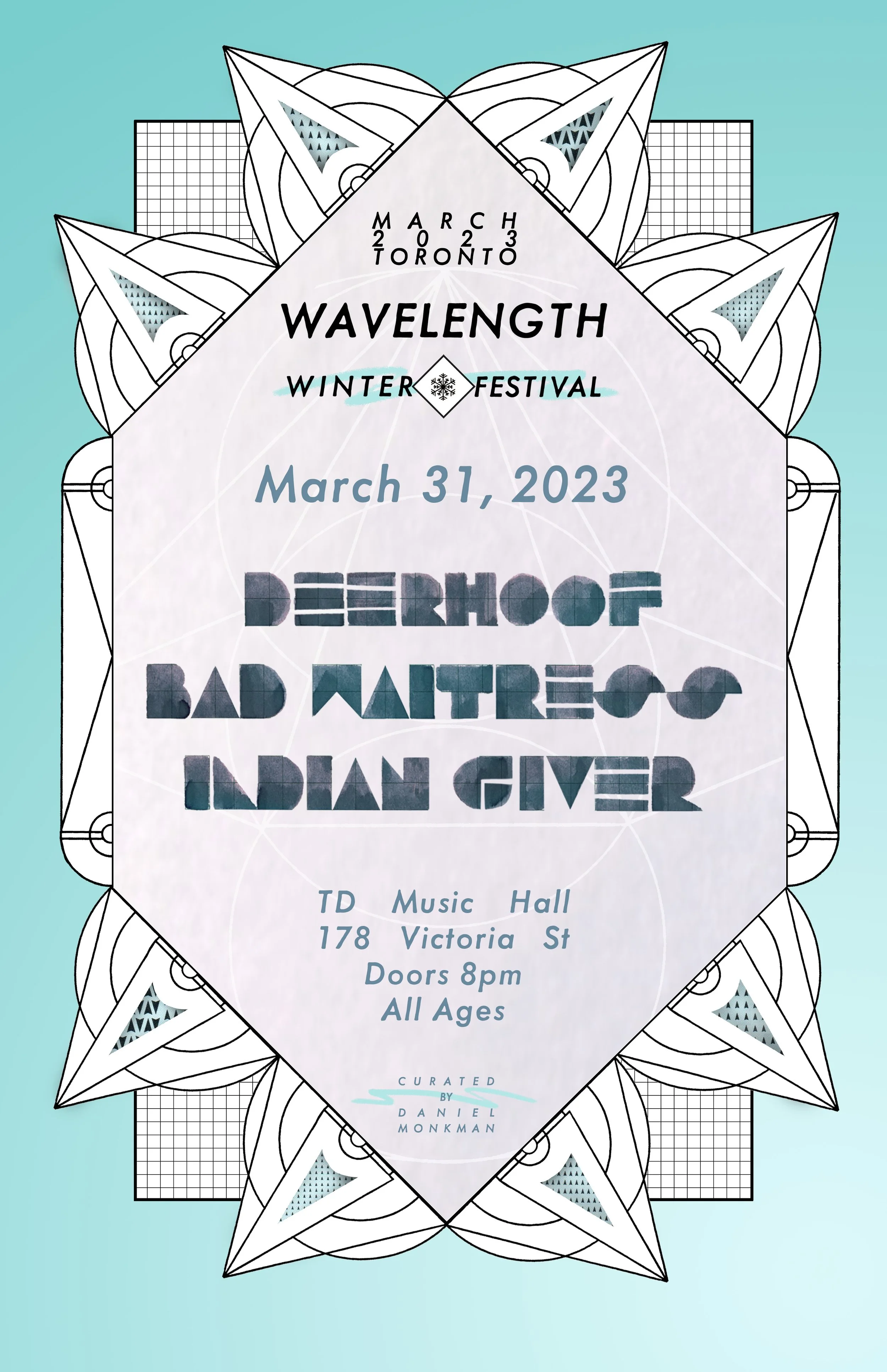
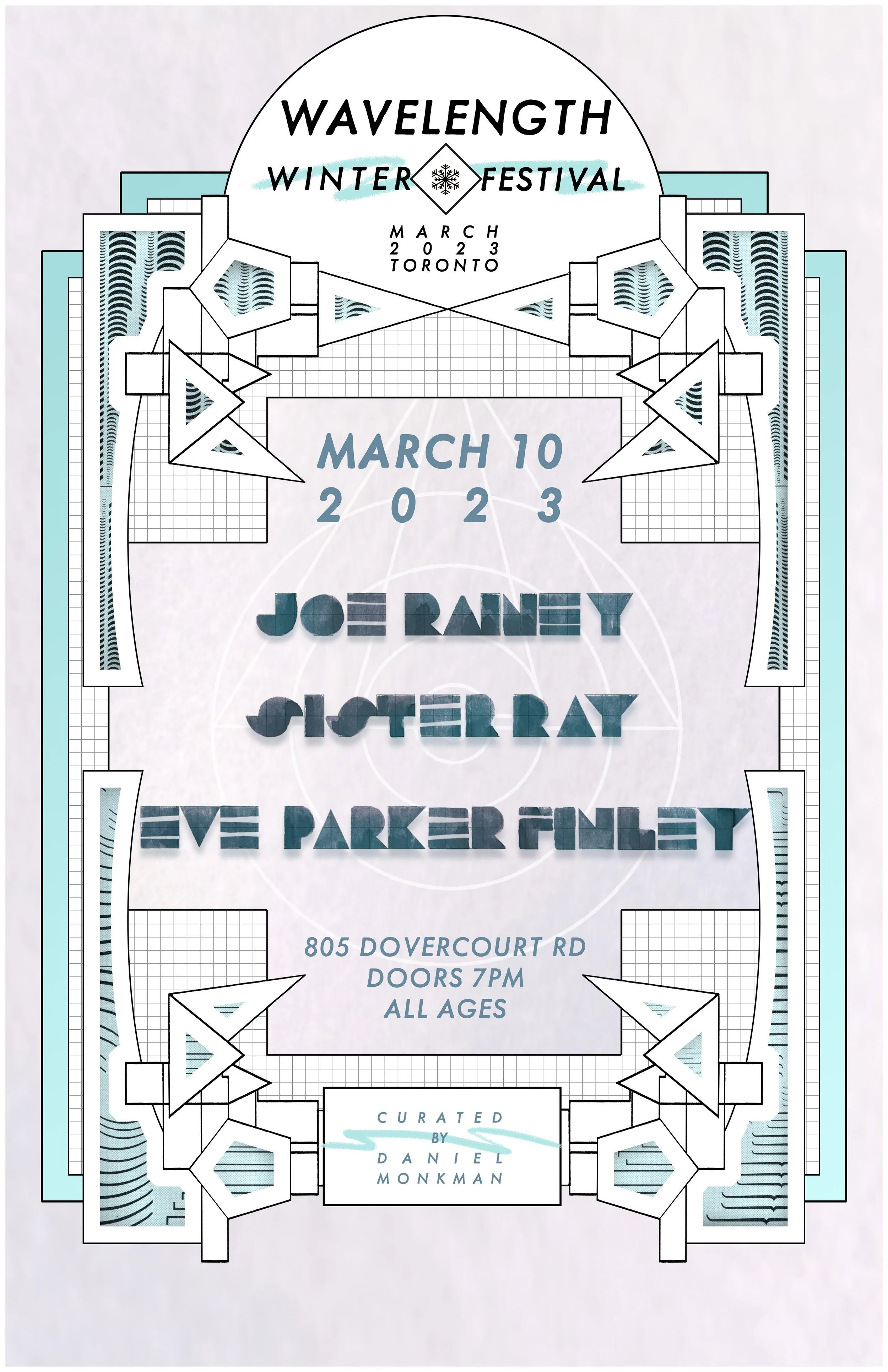
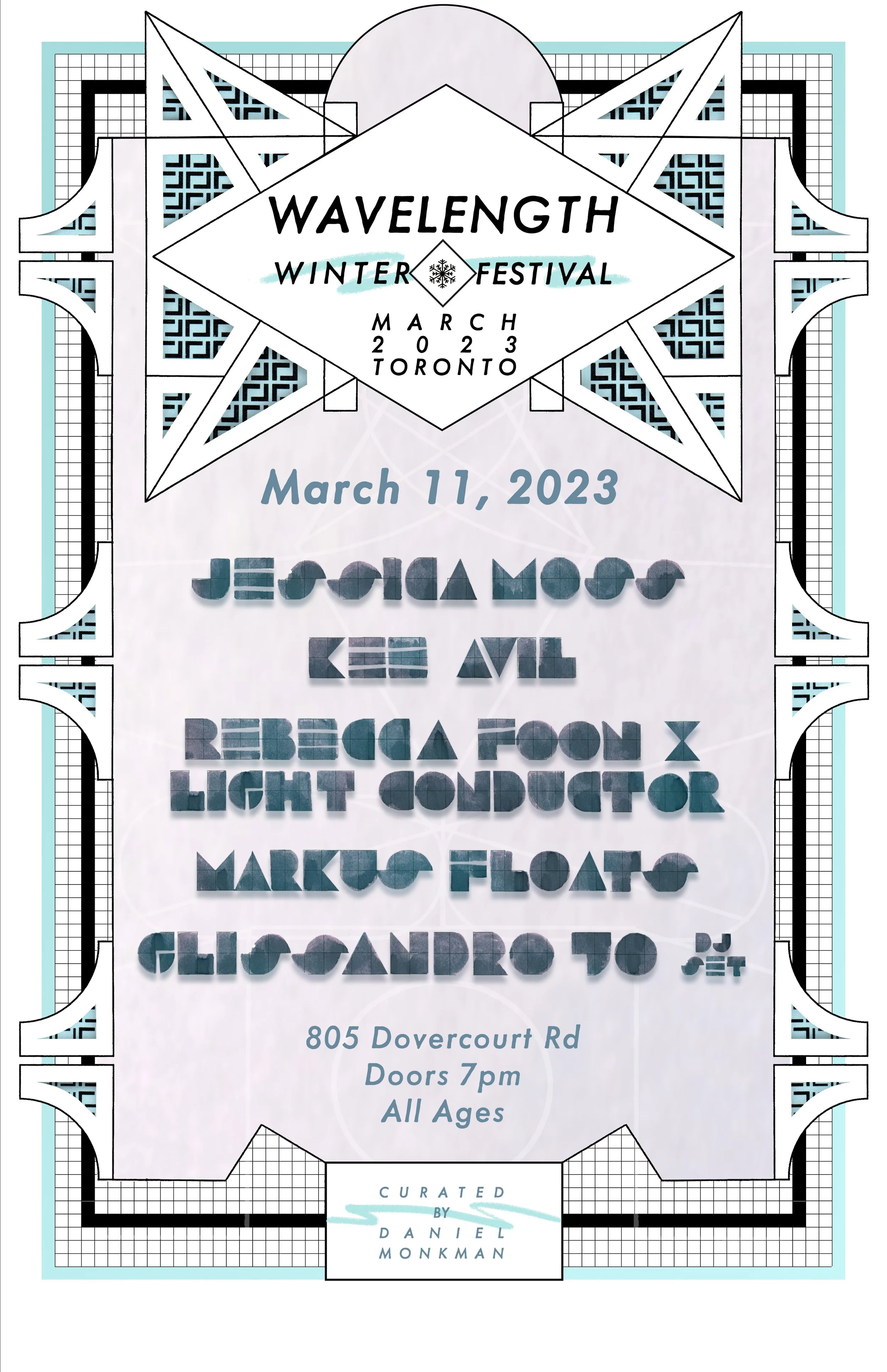
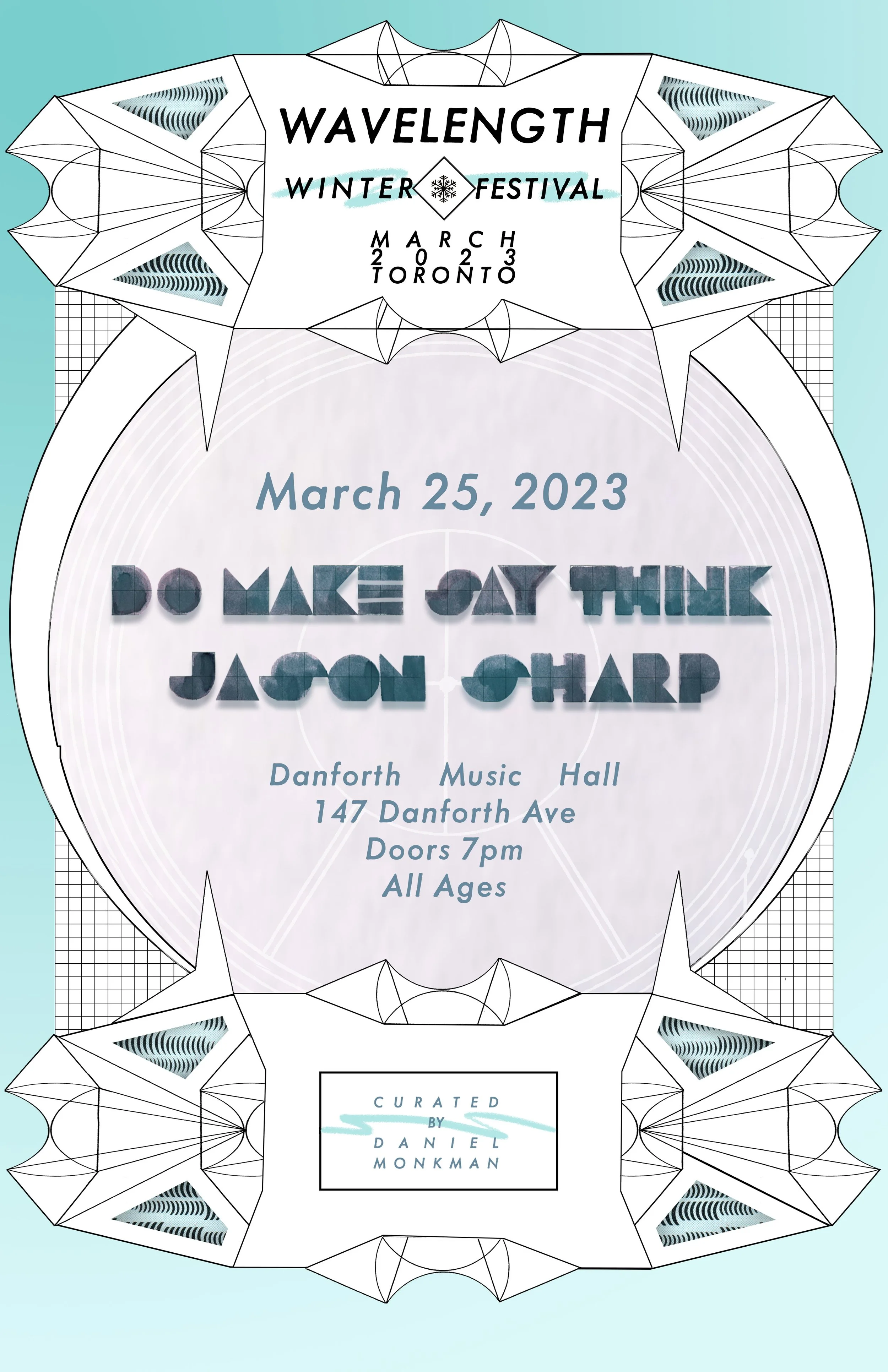
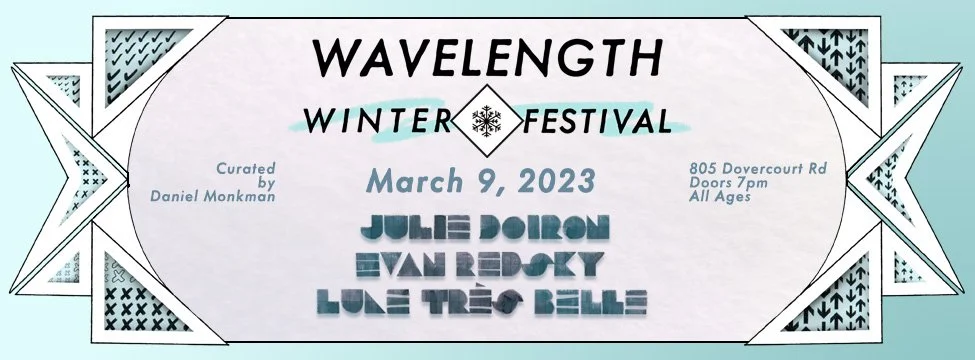
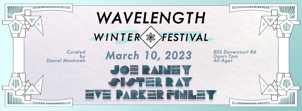
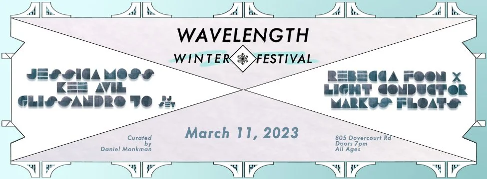
Posters for each evening of the festival feature custom typography design and variations of the main poster’s geometric border motif made up of electrical schematic line art and Letraset type transfer sheets. These posters were designed in illustrator and photoshop and were printed at 11”x17” in full colour.
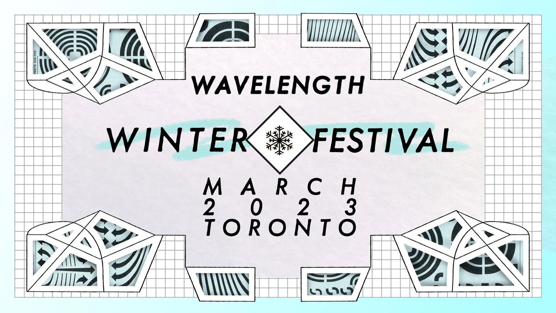
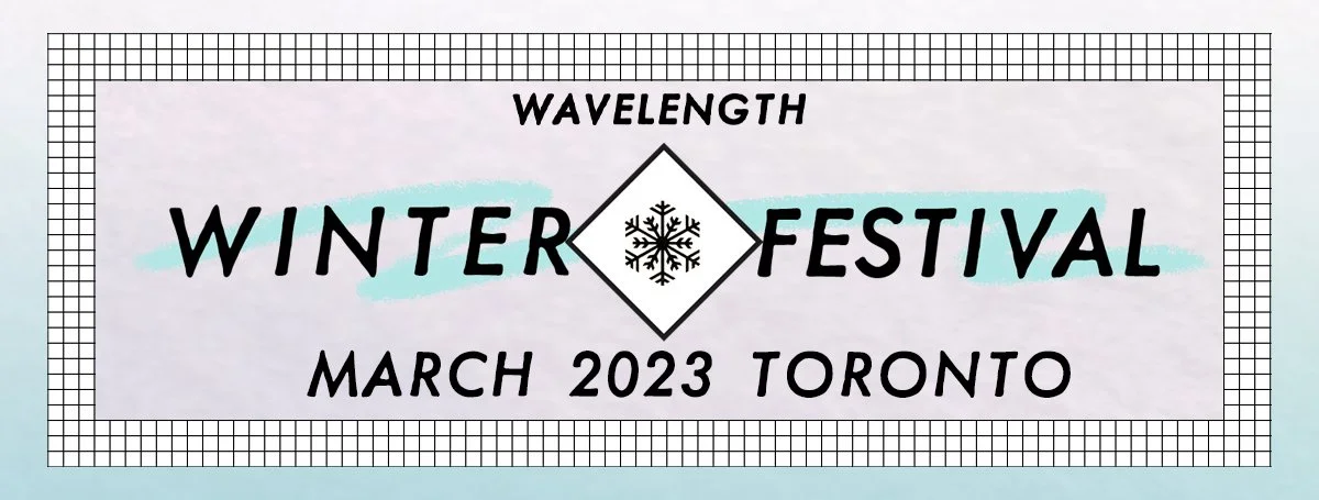
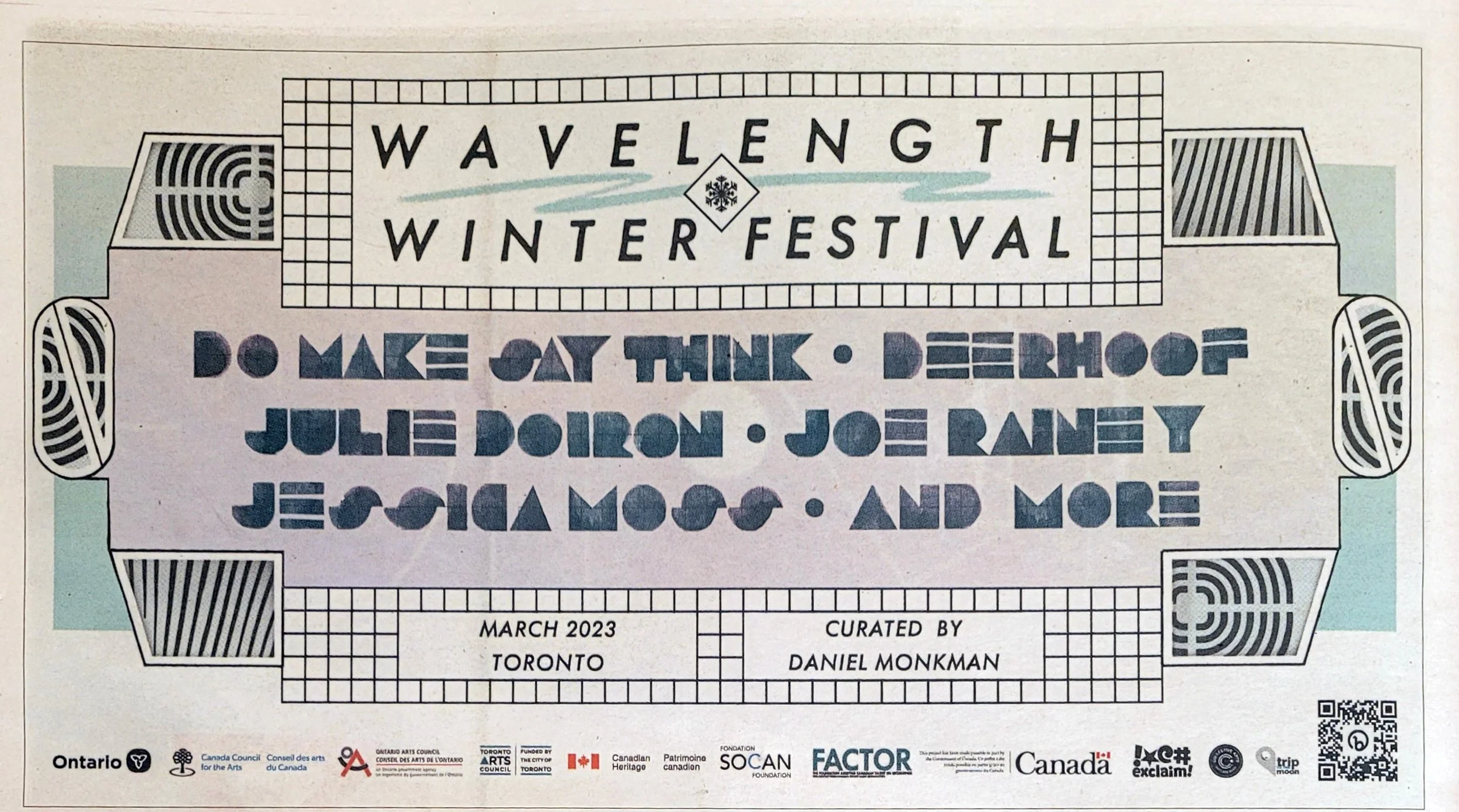
The full festival poster was designed for print at 11”x17” and multiple variants were produced for social media, newsprint ads, and a large-format TTC poster. The custom typography was created by hand with ink made from locally-foraged river grape. The font was named Wharncliffe after the London street where the grapes grew. The geometric border motif was made from electrical schematics line art and letraset type transfer sheets. Lavender & Cyan were chosen for their gentle complimentary hues and icy vibe.
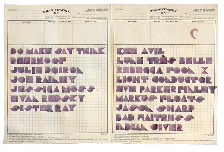
The original hand-painted type design
A variety of banner variants for social media and email were created as well as a half-page ad spot in Exclaim! (a newsprint music magazine).